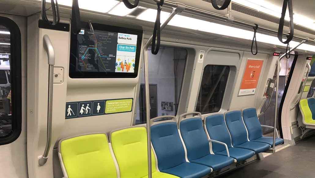
I recently had my first opportunity (finally!) to ride BART’s new Fleet of the Future trains. Huge amounts of research and testing made the new trains a massive rider experience upgrade, but the digital information screens didn’t seem as well developed as everything else in the car. Thankfully, the digital experience is a lot easier to fix than something like the seats or the doors!
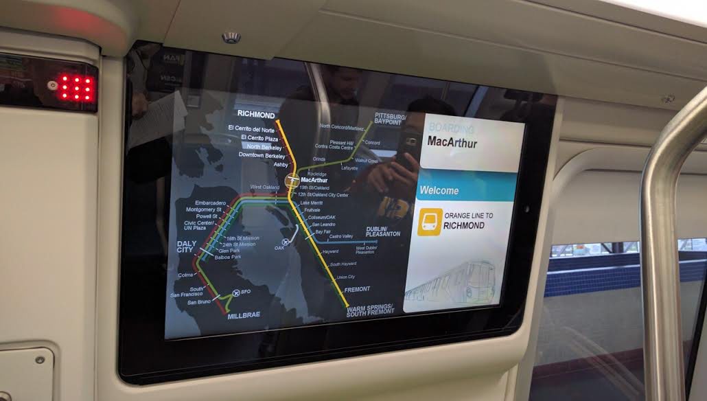
Photo Credit: Streetsblog SF
Even though screens have been around for decades, wide rollouts of real-time passenger information systems are new for many transit agencies - I designed New York City Transit’s first ever real-time line map, which is now live in more than 250 stations across the city. While working on this project, I ran interviews and went through several iterations to figure out just what questions riders need answers to.
“Do I need to get off the train?”
While riding, riders’ number one question was if it was time to leave the train or not. In hindsight, it makes sense - when you’re on a train, you’ve already planned your trip and know your destination. The train is going to one location, along one route. Geography doesn’t matter, other lines don’t matter, and where the train came from doesn’t matter. All that’s important is information about your train, and when you need to get off of it.

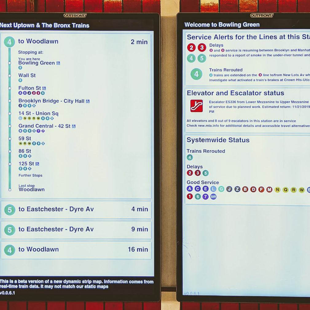
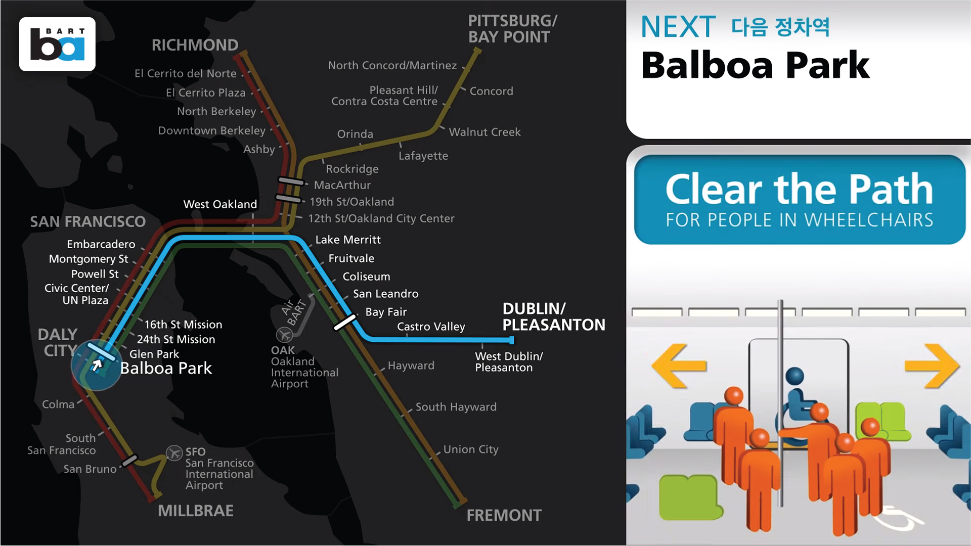
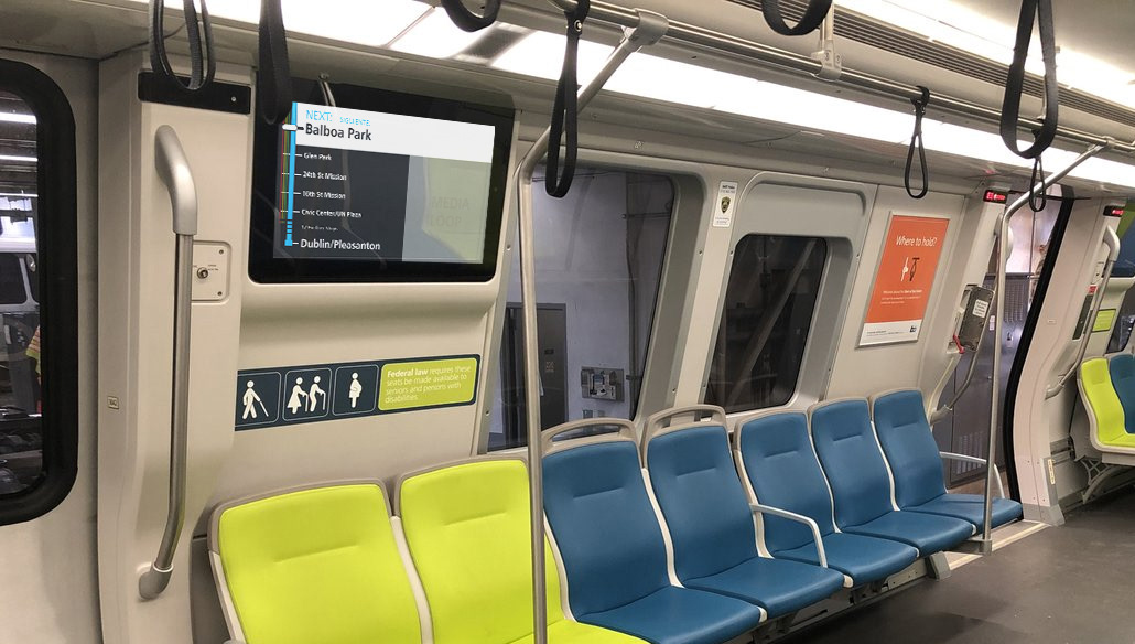
Here, I’ve highlighted the parts of the BART screens that are relevant to the current trip - things that could answer if you need to get off the train or not.
All that important information is either microscopically small or far off in the top right corner, and huge amounts of the content shown just aren't important!
So how can you fix this?
For starters, I stripped out everything that’s not relevant to the current train. That means that the map had to go. A map makes sense when you need one single image to work in every station and on every train car, but with digital screens, you can tailor information to prioritize what’s important to riders.
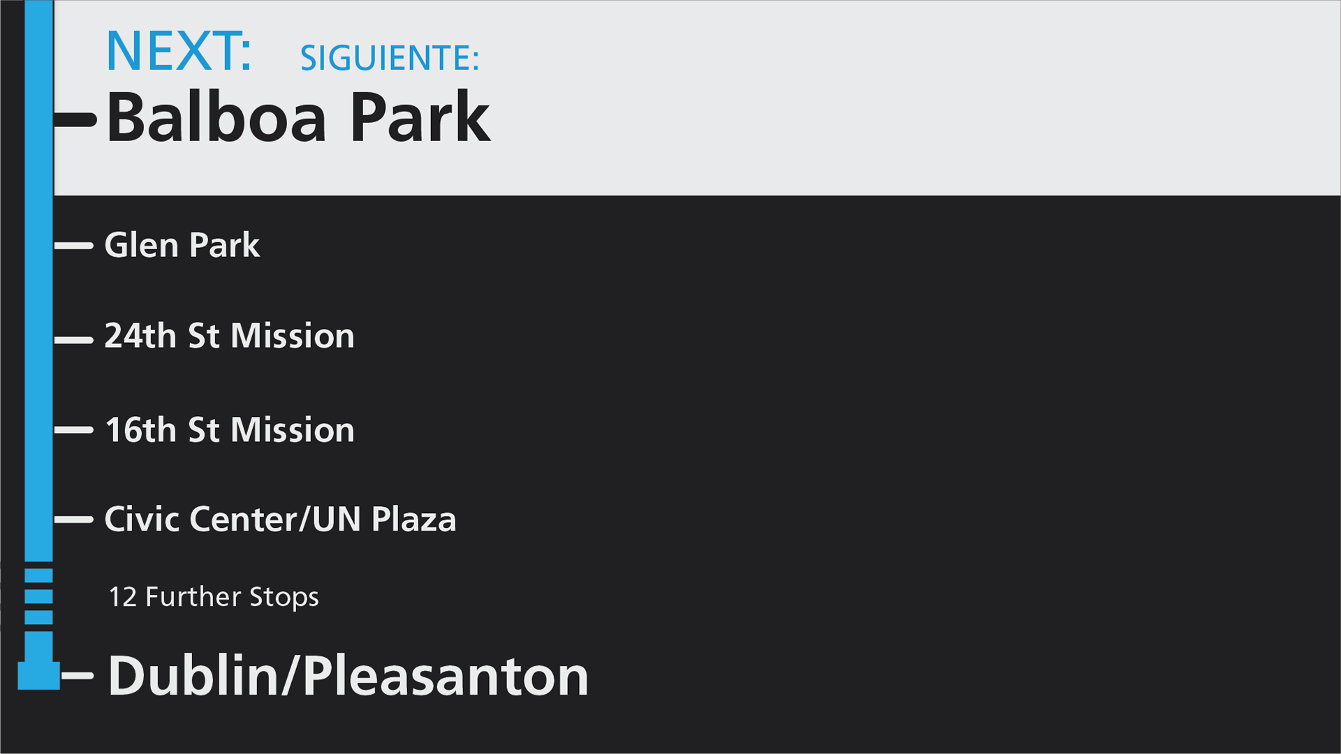
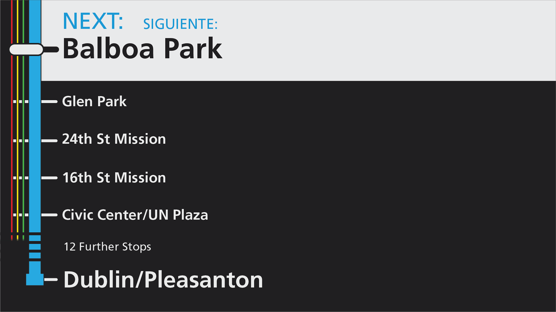
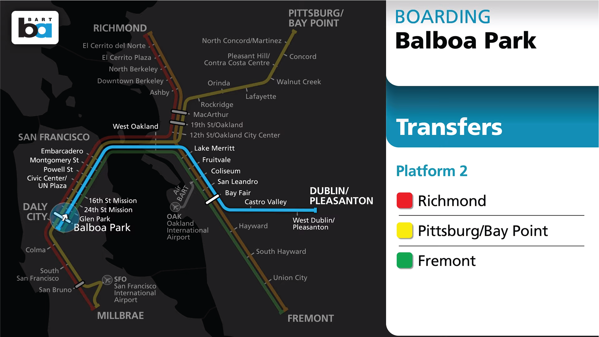
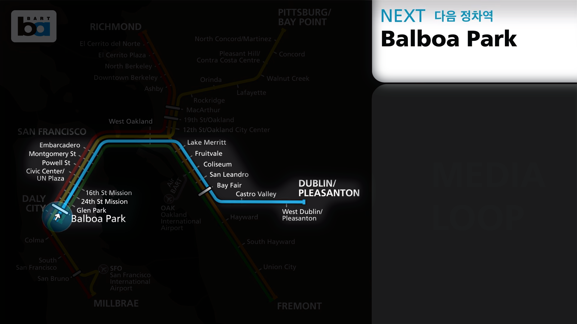
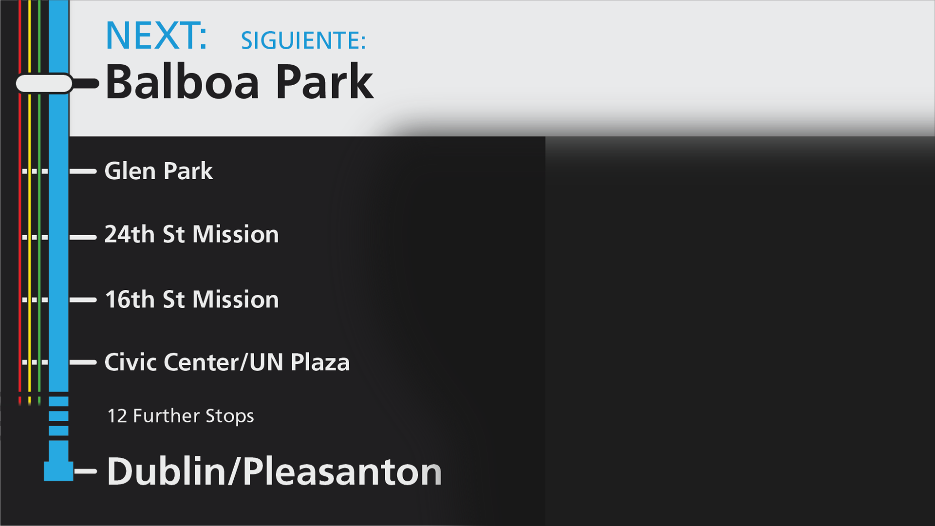
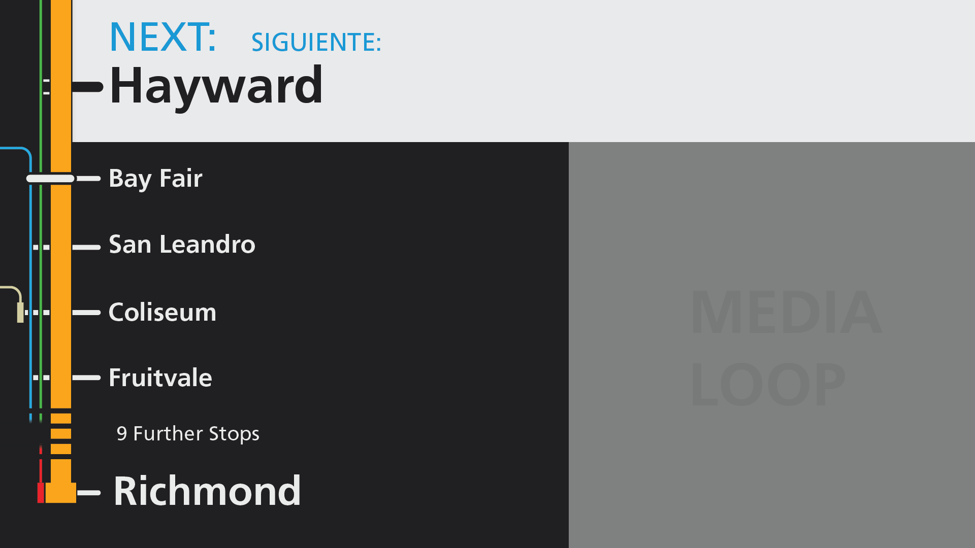
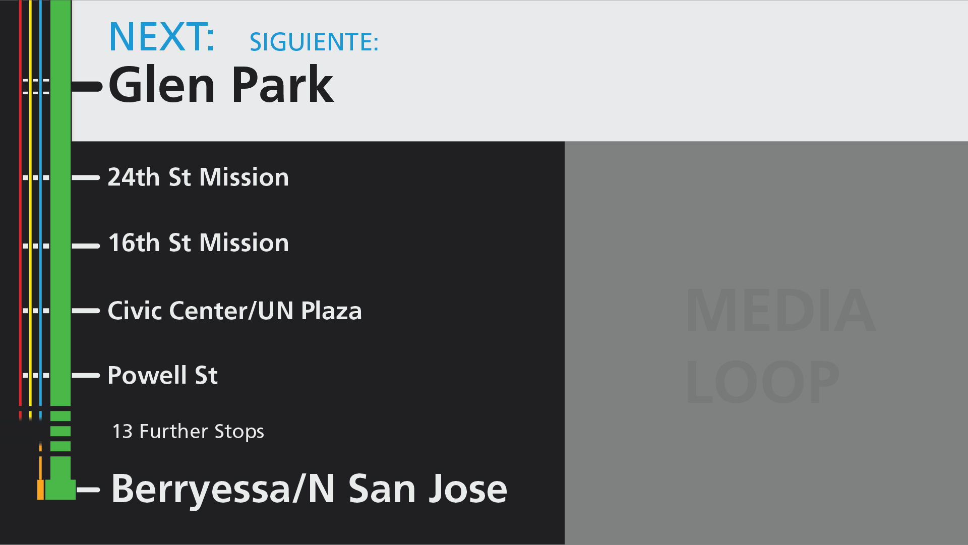
When you strip out geography and other lines from a transit map, you’re left with a line map. I went for a vertically oriented design, anchored by the train’s next stop at the top of the screen. This puts the most important information right on top - if your stop is shown there, you’ll need to get off the train the next time it stops. To further emphasize it, I highlighted the next stop in white and increased its size to make sure that it answers the number one question as clearly as possible.
For most trips, BART trains make more stops than can fit on this screen, so I hid extra stops with a simple “further stops” label. This completes a three part hierarchy of stop labels - if your stop isn’t shown, there’s plenty of time to relax. When it first appears on screen, it’s time to start paying attention, and when it’s highlighted at the top, it’s time for action.
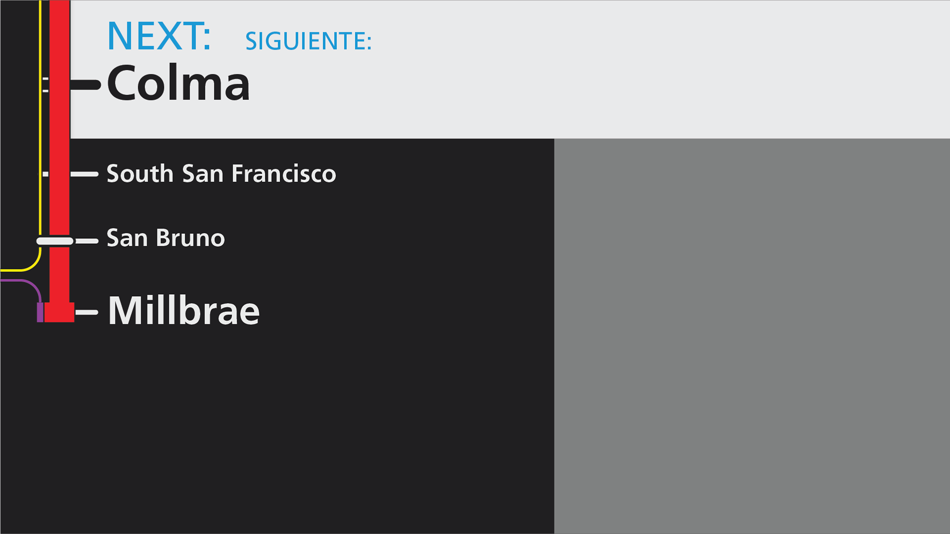
Train direction is critical for determining if you’re on the right train, so finishing the line map with an extra-large terminal label at the bottom creates a consistent placement for any train’s last stop, no matter what direction or what route. After all - if you’re on the wrong train, you need to get off right away.
With the basics of the route map laid out, it was time to add in some helpful features.
Losing the system map did mean that transfers were lost as well. Since BART runs a system where most stops are served by multiple lines, transfer indicators at every stop would become repetitive and busy. Instead, I drew out parallel routes as lighter lines to the left of the main line map. These lines retain the true line colors used elsewhere in the system, and are useful to show first and last transfer points to the current line.
While doing this, I also made sure to include the correct transfer station indicators on the line map, matching the full system map and helpfully indicating timed transfers and other key transfer points on the system.
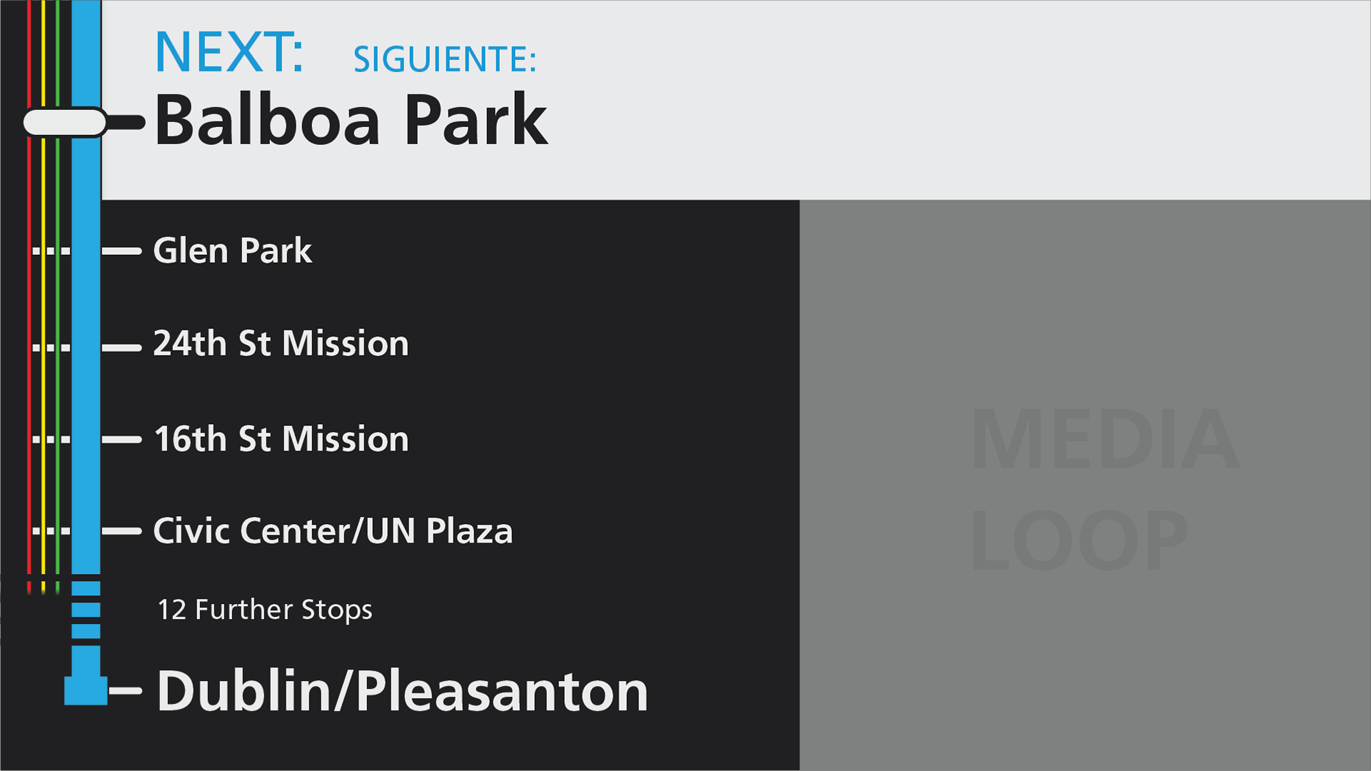
Lastly, I re-incorporated the multimedia loop. At the MTA, much of my job was creating media for various loops playing throughout the system, and one of the biggest frustrations was creating dozens of different versions of media to use on unique screens throughout the system. To help with this on BART, I made sure that the media frame is a 1:1 square, allowing for a single asset to be used both here and on social media.
With rider information shown consistently on the top and left of the screens, I could increase the size of the media container by more than 20% compared to the previous design, while still not disrupting the balance of information. The loop also no longer has to show any train information, so it more time can be dedicated to safety, ridership, and event messaging.
With the main design now out of the way, it was time to start on an important variant - the in-station view.

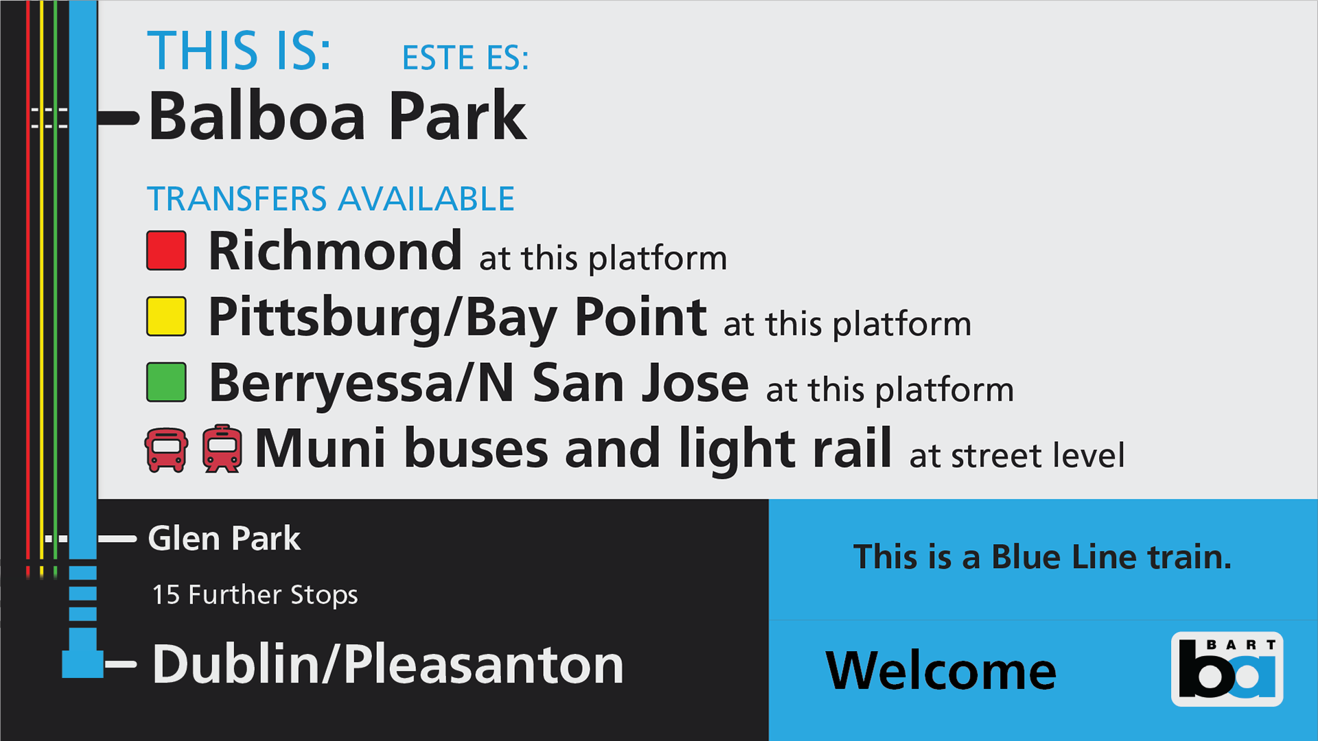
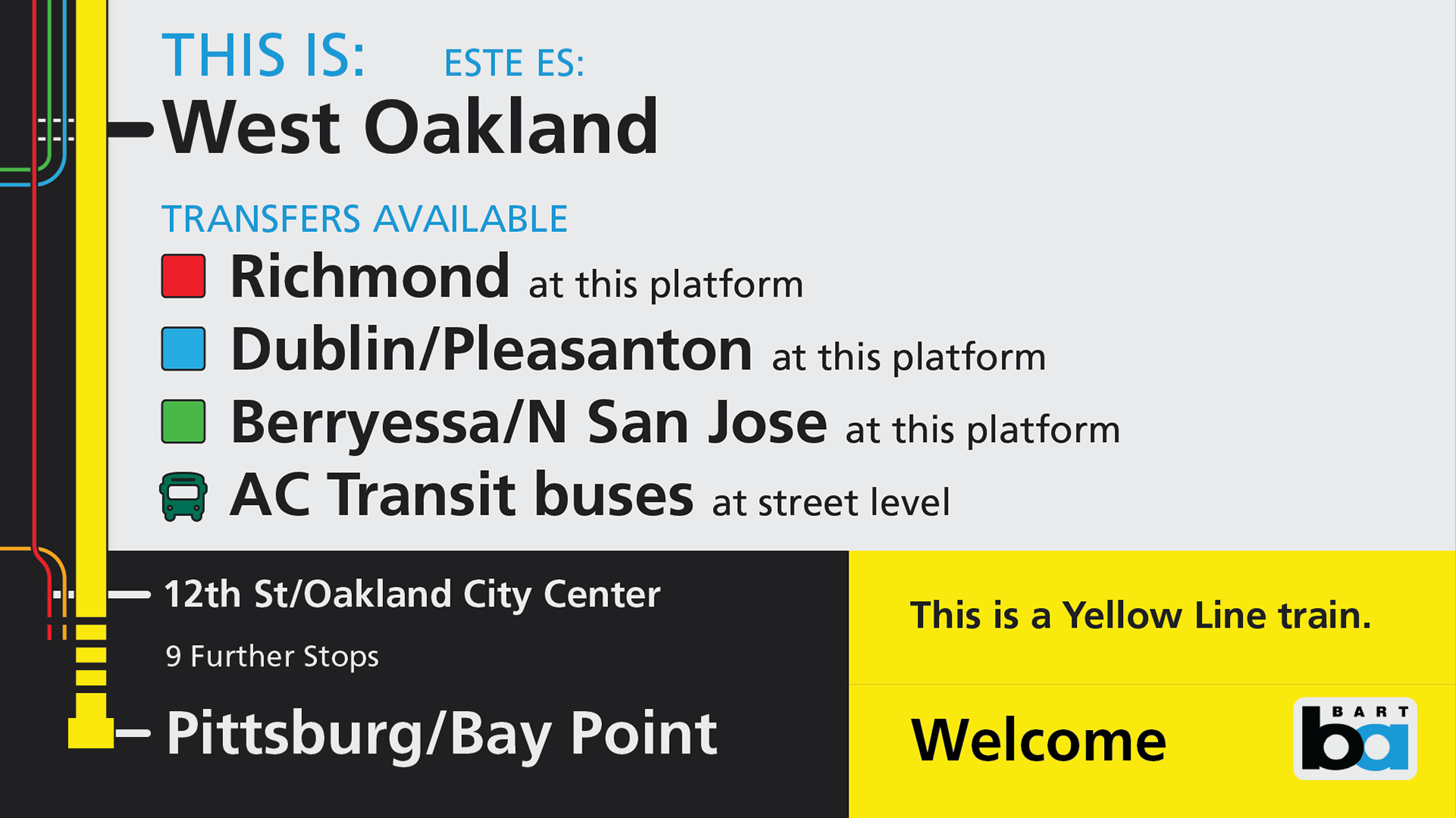
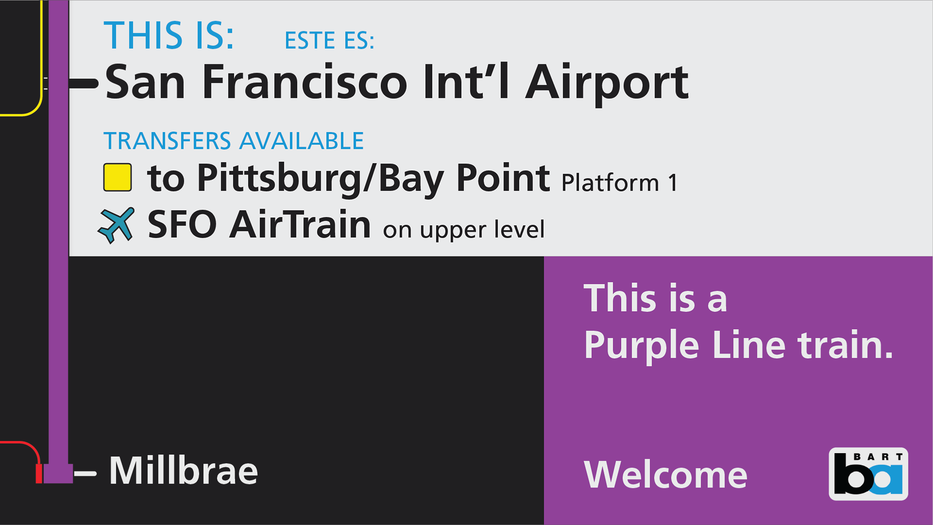
When the train is in the station, screens have to bridge the gap between the train-world and the station-world, and inform people who are leaving the train as well as those who are entering it. To deal with this, I adapted the line-map into a two-section screen.
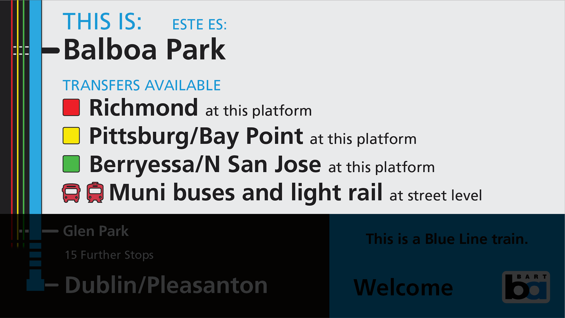
For people leaving the train, the station banner is expanded to show transfers available at this specific station, including those to other modes.
Transfer information also provides locational information for the other routes - many BART stations or transfers can be complex, especially to other networks, and a short description line helps riders know where to go after leaving the train.
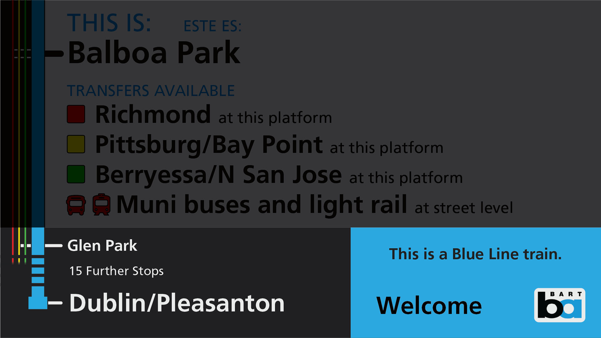
The lower section of the screen is modified to focus on answering a new question for people in the station - “Should I get on this train?”
The bottom left of the screen stays consistent between screen with the line map, since the next stop and train destination are important while boarding and while riding. In addition to the terminal, one further stop is listed to help reinforce train directionality.
In addition to the colored line on the left of the screen, the multimedia frame is replaced by a large section of the screen filled with the current line’s color. To provide an identification option for colorblind riders, the line is also spelled out clearly in plain text. A simple welcome message, rotating through BART’s frequently spoken languages, is included in this color block, to greet riders boarding the train.
Before and After:
Current Design (Credit: BART)

Proposed Design
Current Design (Credit: BART)
Proposed In-Station Design
This is a radical redesign from the system map that BART riders are used to, and it does lose some information. In doing so though, it makes what's important for riders big, bold, and consistent. You can clearly see the train's next stop and destination from across the car, which was impossible on the full map design.
When you compare information about the train the screen is on though, it's no contest. Vastly more of the screen is filled with relevant, targeted information, perfect for the exact time and place of the train, and everything included directly addresses rider questions - you'll know exactly when it's time to get off the train. You can even see it from all the way across the train!
Current Design (Base Image: BART)
Proposed Design (Base Image: BART)
Whether you love it or hate it, I want to know! Feel free to reach out to me on Bluesky, or email me here.
Proposed Improvements:
Between stations:
Next Stop is almost 30% larger.
Current line is consistently located and 4x the size.
Last stop is consistently located and 2x the size.
4 following stops are more than 2x the size..
Media loop is 20% larger and has a 1:1 aspect ratio, making it easier to create content.
In stations:
Transfers clearly shown as part of the station, with larger and more prominent labels
Transfers to other modes are detailed, adding a feature from the print maps not seen on the digital adaptation.
Transfer location is detailed, useful for complex stations, and multi-modal transfers
Current train line color is prominent and displayed as color and text
Next stop and train terminal is clearly listed, to guarantee correct direction
Multilingual Welcome message is shown adjacent to BART logo
Design enhancements:
Eliminated gradients and other dated design elements
Unified text sizes and weights to just 4 sizes and 2 weights
Eliminated transparent line colors to match all wayfinding branding